
Rally as an OpenStack performance dashboard
Rally is a benchmarking tool that tells you how OpenStack performs, especially under load at scale. You can use it to validate, performance test, and benchmark your OpenStack deployment using various pluggable Rally benchmark scenarios. In this fourth installment of a series, we take a look at Rally as the basis for a performance dashboard, showing you how to easily create graphical test results, including pie charts, performance charts, and histograms so you can create reports that are easy to understand, with information that viewers can quickly digest.
In the first three articles of the series we covered:
If you're not familiar with Rally, take a look for more background, then continue here to see how it graphically exhibits the output from simple verification runs, as well as concurrency testing. These reports enable you to easily see issues at integration points and with load testing using Rally’s visual displays.
Testing comes a long way with Rally
Unlike a traditional table, the Rally dashboard has an easy-to-read user interface displayed in Figure 1 that shows a graphical snapshot of a process’s key performance indicators, enabling you to make instantaneous and informed decisions.
Figure 1 - Rally benchmark results in both tabular and graphic displays
As you can see in Figure 1:
“Authenticate” in the upper left navigation lists the group of benchmarks that tests Keystone authentication functionality.
Below “Authenticate” in the left vertical navigation, everything in the list from “Ceilometer Alarms” to “VMTasks” is a benchmark scenario that is run.
The “Authenticate.validate_cinder” heading in the main, upper part of the interface is the full scenario name of the benchmark.
Below the name of benchmark’s full scenario name are “Overview,” “Details,” and “Input task,”which are the three tabs of the report.
The Rally results show how you can use a performance dashboard to transform under-performing data into information that you can use to guide operational improvements of your cloud. You can focus on key areas of improvement with Rally’s detection of OpenStack performance bugs.
Tempest is an OpenStack integration test suite that provides an ordinary table with few details. It doesn't actually provide HTML reports out of the box, but Rally can take your Tempest output and at least make it more readable, as you can see in Figure 2.
Figure 2 - Tempest output
Now let's look at initiating these reports from Rally.Start a benchmark
To start a benchmark test like the one in figure 1, pass its configuration to the “rally task start” command. (You can find instructions here or here.) When it's complete, call a “rally task report” to display a specific task as follows:
rally task report <task_id> --out report.html
Rally is in the process of incorporating benchmarks for all OpenStack-related projects, which is the goal of the Big Tent initiative. In fact, Rally has been the first real adopter of the Big Tent restructurization, breaking the borders between incubated, non-incubated, and integrated projects. For example, Rally now supports testing for Zaqar and Designate, as well as the StackForge project Mistral.
What you can visualize with Rally
With benchmarking tests performed, let’s start from the beginning to read the output, using Keystone authentication as an example. In the Rally interface as shown in Figure 1, we click “validate_cinder” under “Authenticate.” The resulting report has three tabs:
Overview
Details
Input task
Overview
The Overview tab, as seen in Figure 3, displays general information about the scenario, including:
“Total durations,” showing the length of time it takes to complete each atomic action (such as booting a VM or creating a volume) as well as the entire scenario
“Charts for the Total Duration,” which display each iteration of the benchmark scenario
A pie chart showing the ratio of successes to failures
A histogram showing the scenarios plotted against the amount of time it took to complete them
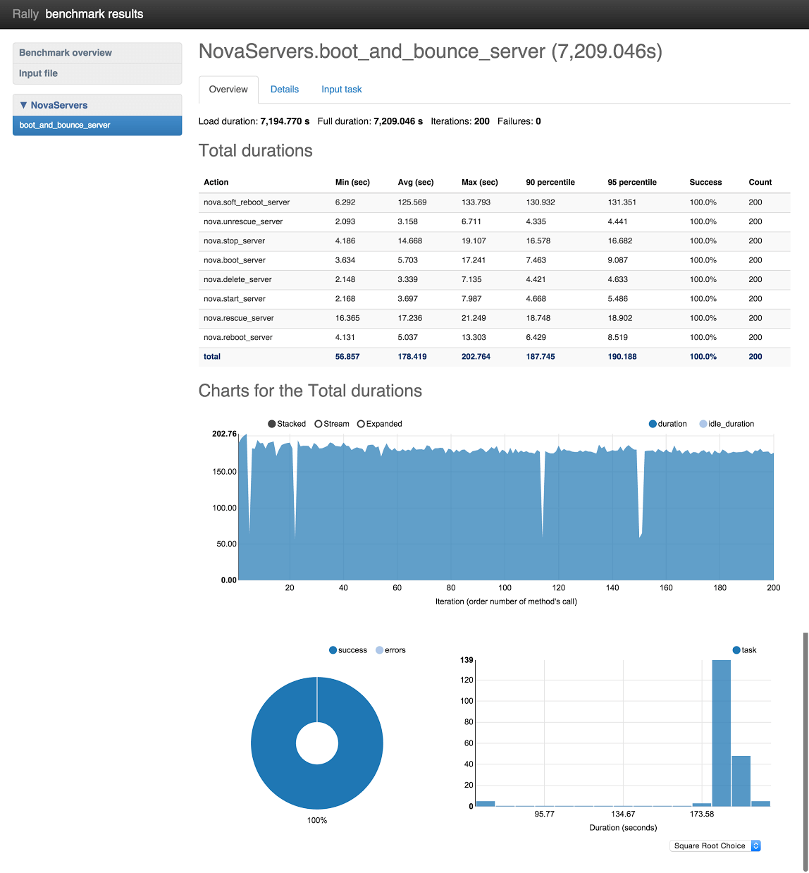
Figure 3: Overview scenario
The Total durations results output at the top of Figure 3 display the statistics of atomic operations at the 90 and 95 percentile. In the figure above, that includes booting the VM, performing a set of actions on it, and deleting it. A 95-percentile is the lowest duration value, meaning that 95% of benchmark scenario/atomic action iterations took time less than this value. If success is not equal to 100%, some iterations have failed.
In the Charts for the Total durations graphic, you can look through the results with or without idle duration. Idle duration is all idle time while executing the scenario method, such as:
Time to boot the VM
Idle time
Time to delete the VM
These charts are useful to pinpoint bugs related to scaling. Usually the desired outcome for the pie chart is to be a solid color, indicating 100% success. However, the definition of "success" is actually configurable; you may want to write negative tests, which means that in a properly working system, the scenario must fail. For example, you may want to test the API rate limit. In these cases, a successful outcome will include a graphic that accurately displays less than 100% success.
Details
The Details tab displays an atomic action analysis for the scenario being tested. For example, the scenario “boot_and_bounce_server” in Figure 4 consists of the atomic actions “boot_server” and “bounce_server”. The reports under the Details tab display graphs for each atomic action, as well as graphing each atomic action separately. This information makes it trivial to find bottlenecks in your benchmark scenario.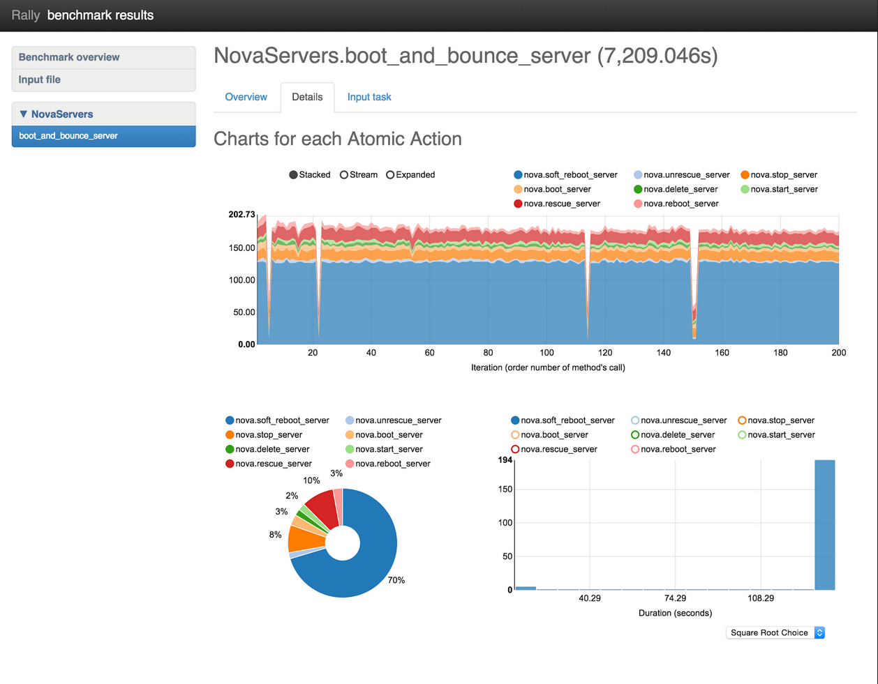
Figure 4: Details graphical display
The Details tab shows the following charts, as shown in Figure 4:“Charts for each Atomic Action” displays actions divided into iterations.
The pie chart shows the time spent on each action for comparison.
The histogram displays the distribution of action duration in a bar chart, with X=duration, and Y=number of iterations of that duration
Input task
The Input task tab displays the scenario configuration and the atomic actions it must complete. Let’s take a look at graphics from the actions NovaServers.boot_and_bounce_server: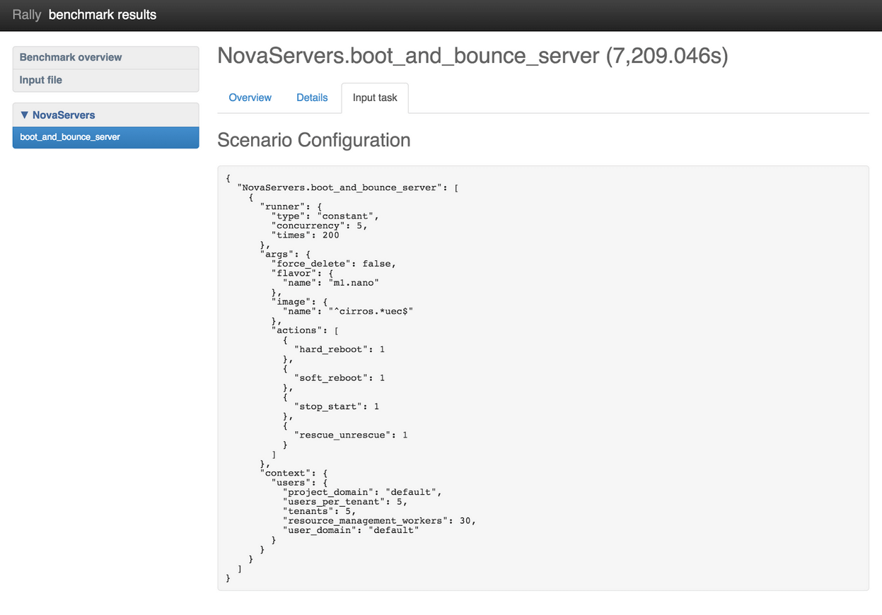
Figure 5: Input task output with NovaServers.boot_and_bounce_server benchmark scenario
All input files in a scenario configuration have a similar structure. ScenarioClass.scenario_method is the full name of the benchmark scenario, which in Figure 5 is “NovaServers.boot_and_bounce_server”. It consists of the following:A “runner” specifies the load type that should be generated. For example, you may want to test for a constant load, a load that occurs with a particular frequency, or one that uses some other pattern.
“args” specifies benchmark scenario parameters such as the image and flavor to use.
“context” defines the benchmark environment that Rally should create, including temporary tenants and users with customized quotas, roles and security groups, as well as other scenario requirements..
Still to come in Rally
In addition to “Overview,” “Details,” and “Input task,” our developers have created a “Failures” tab in a new patch set to Rally, which displays failures that occur during benchmark testing.
As shown in Figure 6, Failures will deliver a table with information about all failed interactions, including order number, exception type, and exception message. When it becomes available, you’ll also be able to click on a row to display a full trace of the exception.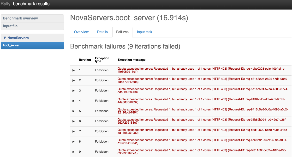
Figure 6: Failures table
With its full range of features and graphic reports, Rally can help you easily pinpoint where you need to modify your cloud deployment for best performance. In test clouds and clouds already in operation, you get visual breakdowns that can help you diagnose problems at integration points and under load testing.
And of course development continues, as Rally is a community project. For example, Solinea presented this helpful video about Rally at the Paris Summit. We'd like to know how you use Rally, and what you'd like to see it do next. Let us know in the comments what you think is important.


